This is a Quarto-based slideshow. When you execute code within the notebook, the results appear beneath the code.
Code
library(tidyverse)library(foreign)
Data Exploration
A lot of this material is from R for Data Science, a freely available book.
Understanding the Data
One of the first tasks is to better understand the data.
Both epistemological and ontological perspectives: how we think the data were created, and what properties exist in our data.
Often that means background reading, e.g., a literature review or domain modeling.
What are your intuitions about how the data would be generated, e.g., for job application information?
Loading Data
Next, take the data and get it loaded into R or Jupyter.
My favourite toolset is the Tidyverse, a set of libraries and philosophies for manipulating R data frames.
Loading data is initially easy but quickly becomes a major challenge as data gets larger and more complex. A non-trivial amount of effort can be spent wrangling data into the correct format.
A big part of TidyR is to get the data into a “shape” that is easy to work with.
Example Dataset
Let us consider the following datasets from the SEACRAFT SE data repository. Look at files in the common ML self-describing text format ARFF.
Let’s say we are interested in how well Halstead complexity predicts defects.
What is Halstead complexity? What are these complexity metrics in general? Do some research with your partner.
Chaining
In Tidyverse language, use the TidyVerse chaining operator %>% (pipe) to group operations on dataframes/tibbles.
Useful operations include mutate, filter, summarize/group_by. I find these operations extremely powerful for manipulating the data. You can think of them as data frame analogues for SQL query statements.
Data Wrangling
I suggest you load your data into a data frame and then chain filters into it, rather than “fixing” the dataset in a separate step. That way you get to see all the data wrangling in one place. It can be really easy to miss a step and end up with outliers that are included, aggregations that don’t make sense, etc.
Code
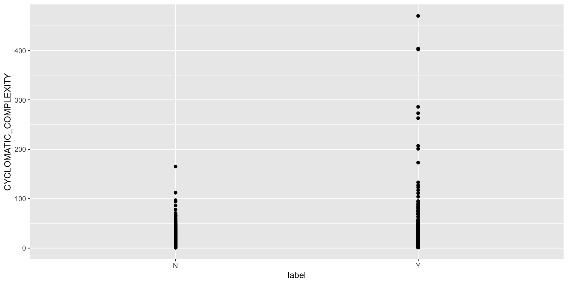
jm1 = jm1 %>%mutate(norm = HALSTEAD_EFFORT / LOC_TOTAL) invisible(as.logical(jm1$label)) #(but should be logical)jm1 %>%count(label)
# A tibble: 2 × 2
  label     n
  <fct> <int>
1 N      6110
2 Y      1672
The ggplot() library in R (and MatPlotLib in Python) are best in class visualization approaches with a vast amount of options and when combined with the filtering/aggregating, can do almost anything.
Use ggplot to explore your data and dimensionality.
Exercise
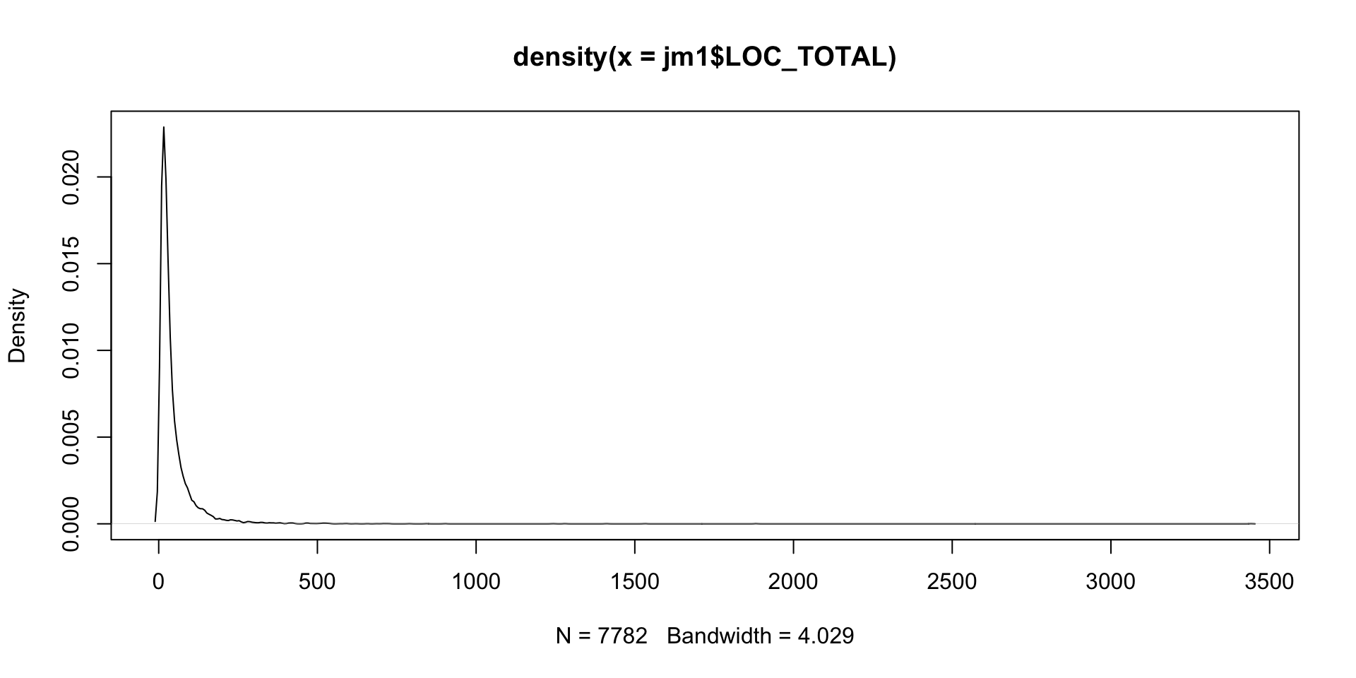
What distribution fits the data set? Hint: this is sometimes done with kernel density plots.
Visualization
Visualization can help understand what is happening. Descriptive stats such as mean, median, variance can give some numeric information conditional on the distribution involved.
These are typically generalized as location and dispersion, e.g., where the big clump of data lives in the normal, and how spread out it is.
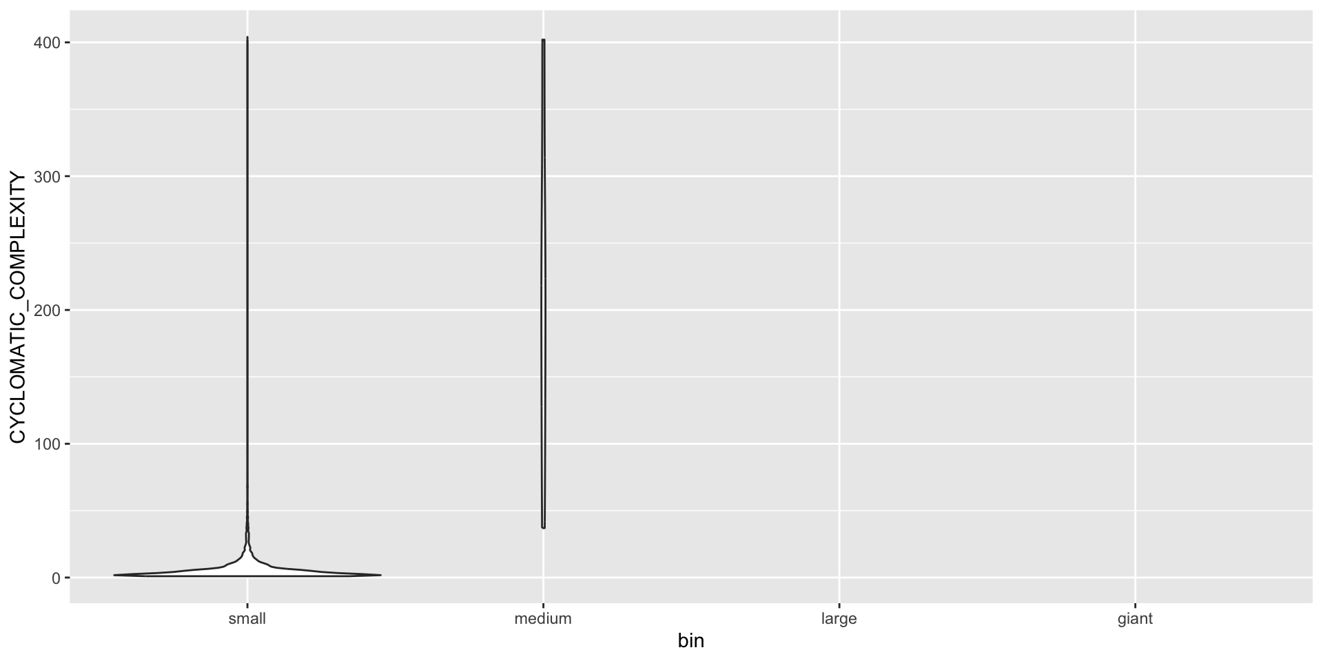
# by bin using violinsggplot(data = binned, mapping =aes(x = bin, y =`CYCLOMATIC_COMPLEXITY`)) +geom_violin()
Code
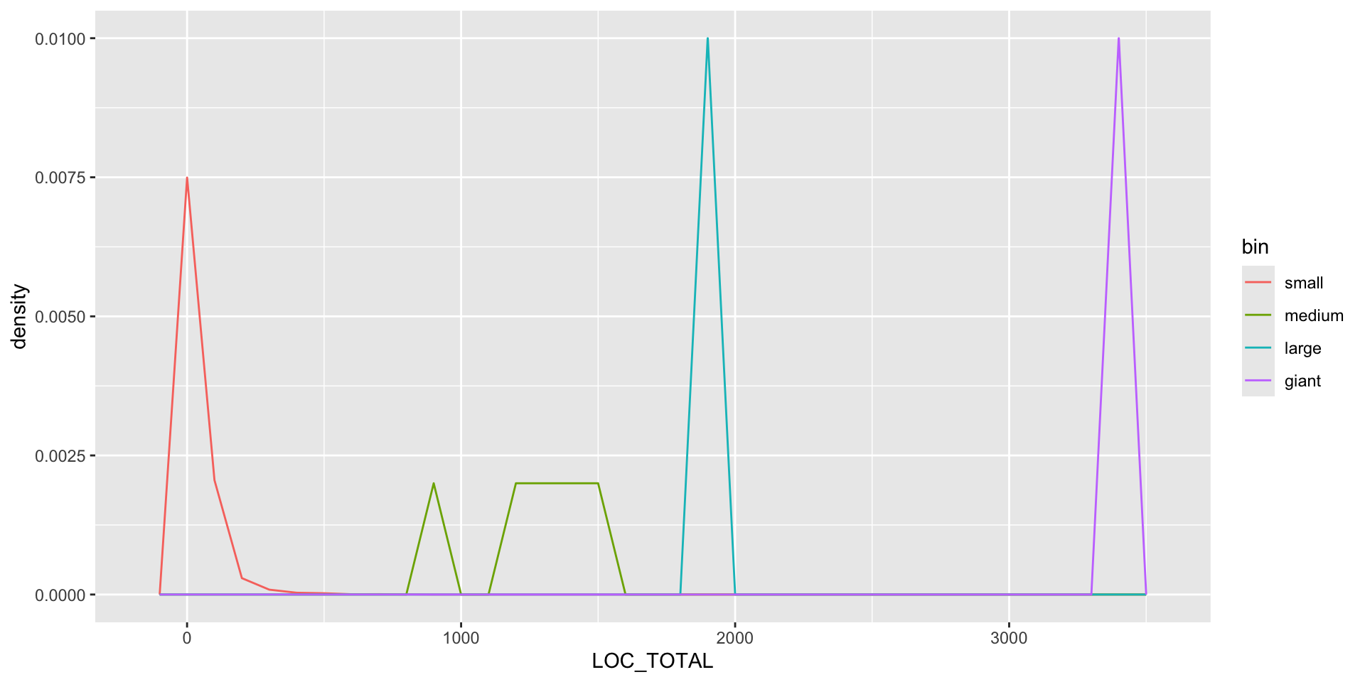
# KDE d <-density(jm1$LOC_TOTAL)plot(d)
So What?
Recall that understanding the underlying distribution allows us to
take a shortcut in modeling the data generating procedure (i.e., “it is like a coin flip” or “it is like human heights”)
simplify the inference to simulate and predict
leverage well known statistical tests
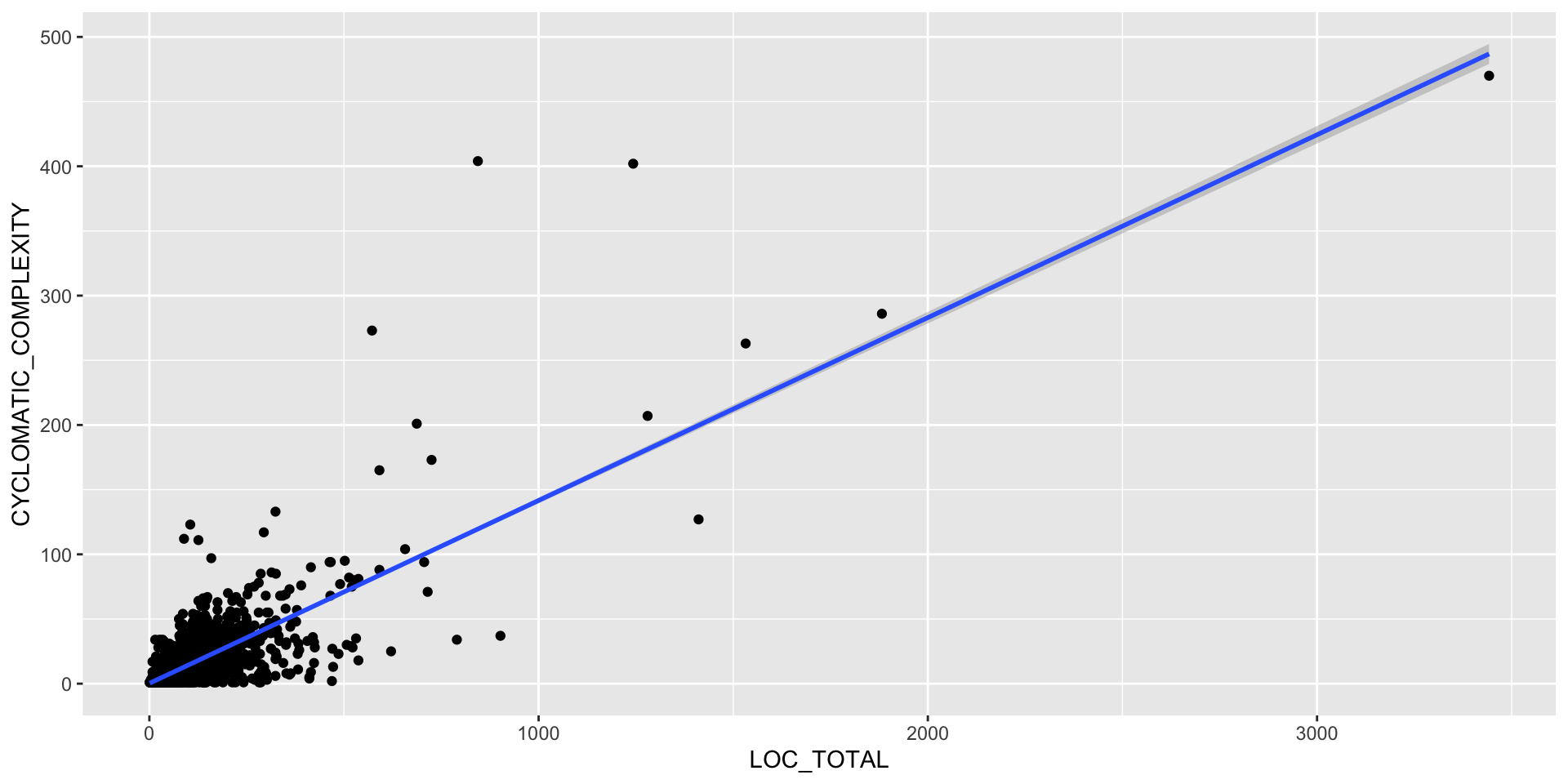
Correlation
Thinking back to our causal models, some of the variables are correlated, possibly causally.
We should look for correlation because it is a great source of confusion; either implying some effect that is really due to a hidden mediator, or making us run extra analyses that are all based on the same underlying mechanism.
Furthermore, correlation - aka multi-collinearity - is something we try to remove in regression analysis as it makes the model overly sensitive and possibly inaccurate.
What types of correlation are likely in the data? Hint: think to first principles for the way the metrics get constructed, and how you know source code is created (your “data generating process”).
Correlation Analysis
Keep in mind this can be a problem with artificial variables too (the ones made up of other variables).
Code
## scatter plot and linear modelggplot(binned, aes(x=LOC_TOTAL, y =`CYCLOMATIC_COMPLEXITY`)) +geom_point() +geom_smooth(method=lm)
# correlation is the covariance normalized by standard deviations to normalize from -1 to 1
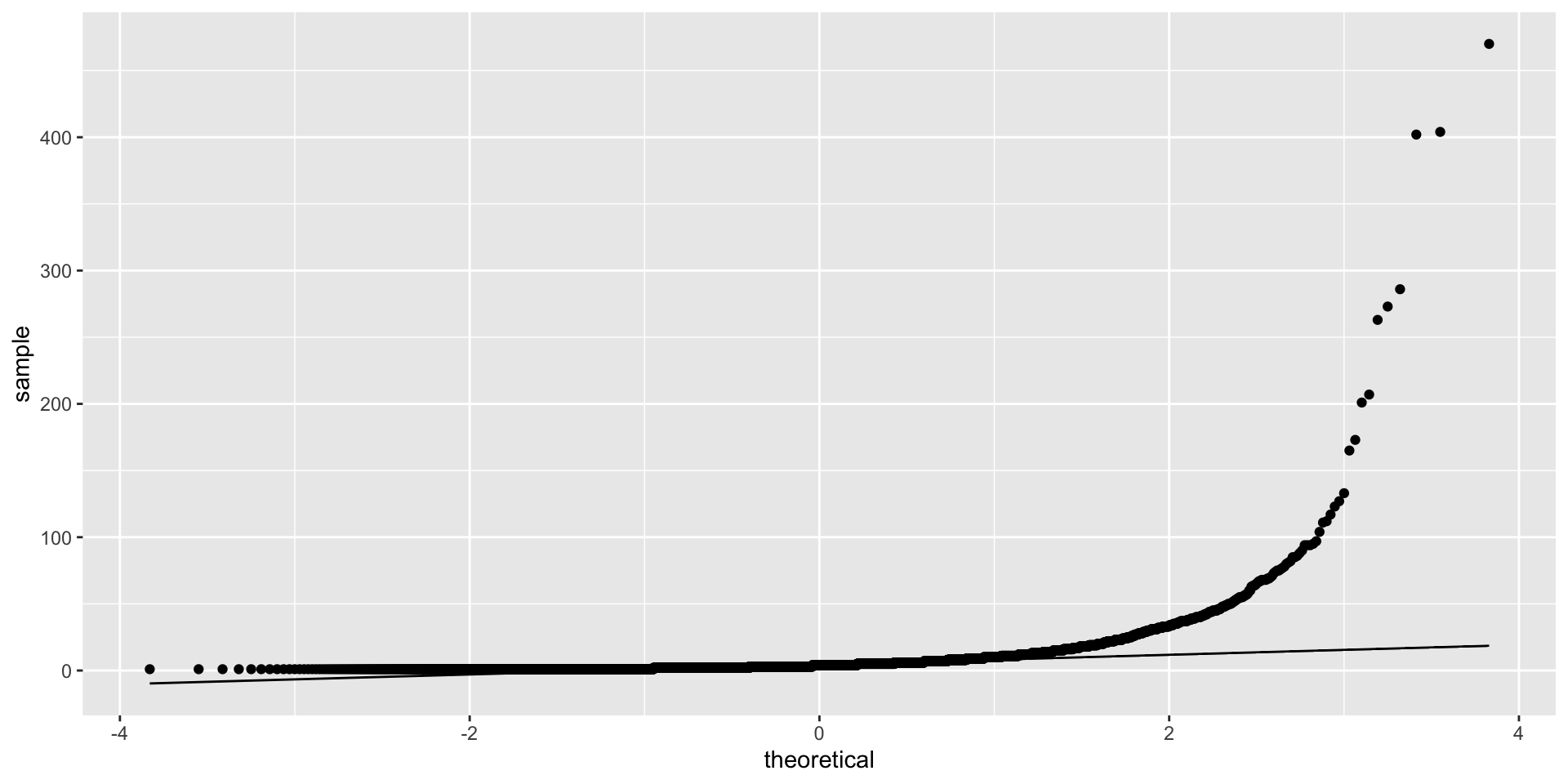
We can use QQ plots (quantile-quantile) to examine fit to a distribution. The distribution’s known shape is the central line and the actual data fit is the dots.
as a rough approximation of correlation. Remember to plot the data first, to see what the numbers are telling you.
Dimensionality Reduction
One challenge with datasets with lots of dimensions (variables/features/columns) is that running algorithms gets worse.
For example, if we have an algorithm like nearest neighbours with a distance function, the distance function will perform very poorly in high-dimension spaces (the curse of dimensionality).
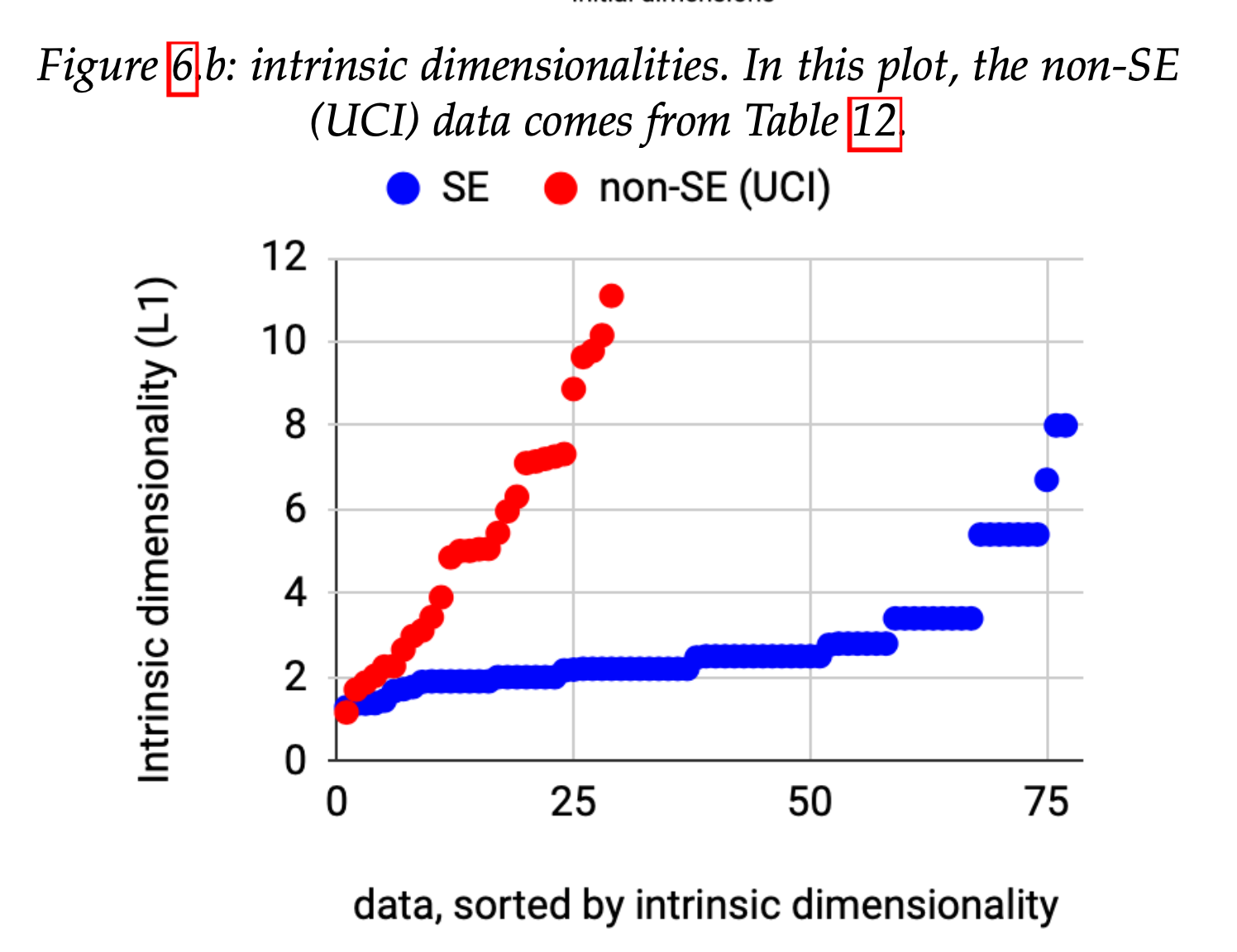
The good news is we believe, empirically, that most SE data has low inherent dimensionality. This is important since, as Fisher points out,
Further advances in advanced software analytics will be stunted unless we can tame their associated CPU costs.
Compare SE datasets to UCI (standard ML test data)
SE data often binary labels and imbalanced
SE data have lower intrinsic dimensionality
See 10.1109/TSE.2021.3073242
So What To Do?
Do less parameter tuning: the data are simpler, so you do not need thousands of trials. But as data has more dimensionality, the SE specific learners will be less effective.
Share less data: drop the individual data points and look at representatives or clusters (e.g. the centroid).
Reduce the excess dimensionality of SE datasets
Principle Components Analysis
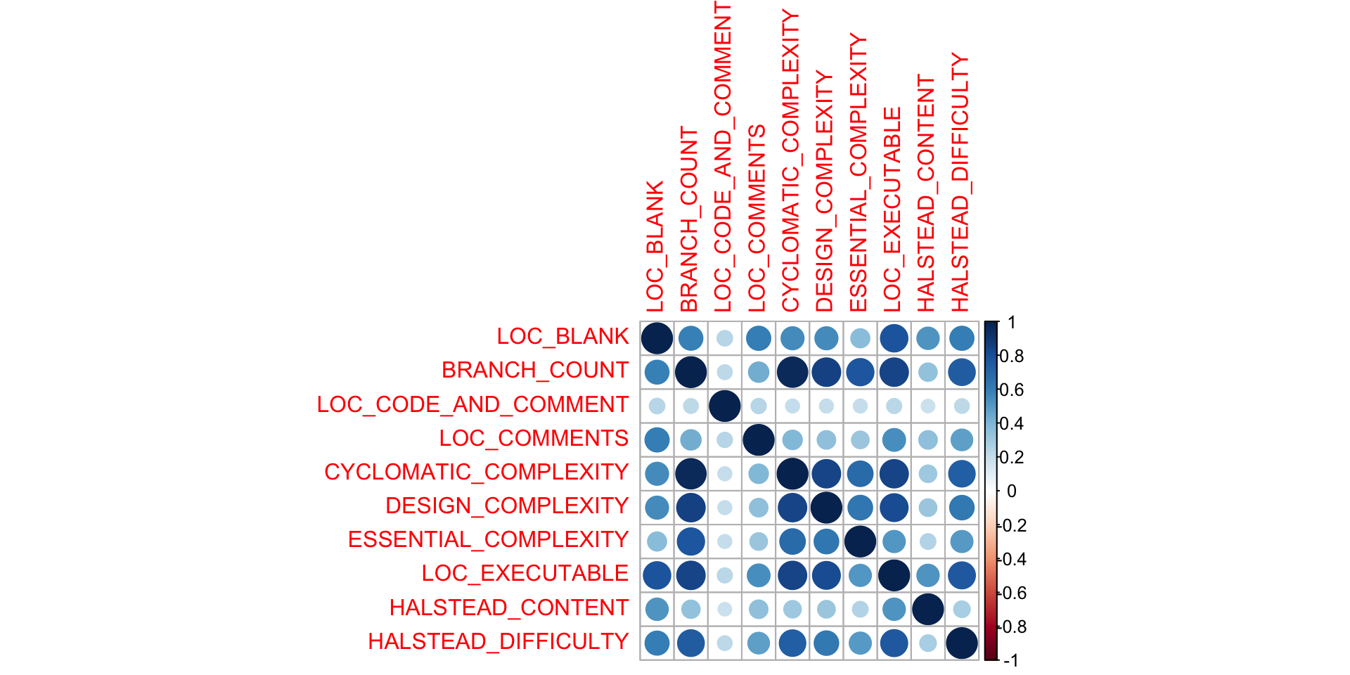
In some cases you can do a correlation analysis and throw out predictors that are correlated.
For example, flag each column with USE? and explore how well each one helps the performance of the classifiers score. Problem: exponential! Better: do a search through feature space.
Code
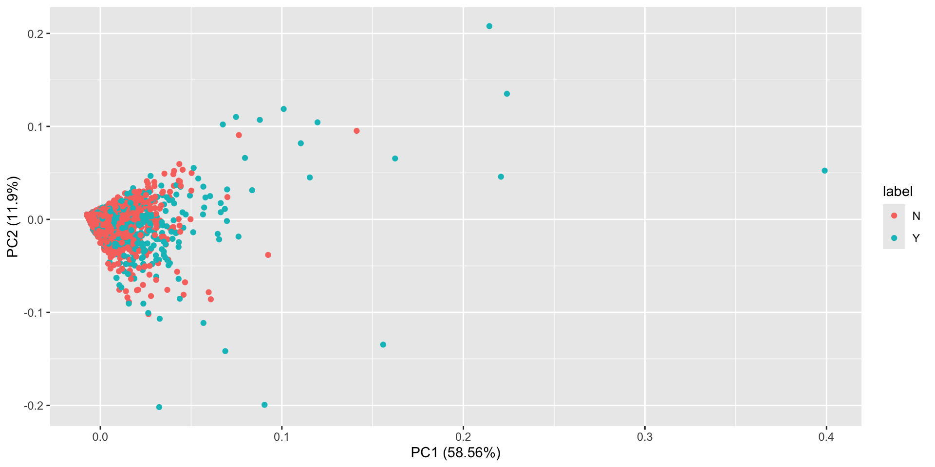
jm1.pc <-prcomp(jm1[c(1:10)], center =TRUE, scale =TRUE)summary(jm1.pc)
And we can see that PC1 contains 59% of the variance, PC2 contains 11%, etc. Thus the variance in our 10 columns has been reduced to 3-4 principle components.
Code
library(ggfortify)autoplot(jm1.pc, data = jm1, colour ='label')
This plot shows us the first 2 components with the associated labels. We don’t see any obvious separation here.
Unsupervised Classification
We have been working on problems where we have columns X and labels Y.
But what if we only have X? This is 99% of the data in the world, of course, annoying CAPTCHAs notwithstanding.
Unsupervised
Unsupervised learning is about finding relationships between the Xs (sort of like PCA was doing). One simple approach is to ask, can I cluster my data points into (N-dimensional) groups, such that a point \(m\) is in cluster \(J\)iff there is no closer cluster?
This assumes “distance” in vector space means similarity in the real world, of course.
Weka
One useful library for doing this, aside from the builtin libraries in Scikit-learn and R, is Weka.
Supervised Classification
Now let’s say we have Y (the labels / ground truth) and want to partition our data so we maximize the accuracy with which we label the instances.
There’s a long list of approaches to this problem (so-called shallow learning): decision trees, support vector machines, etc.
Exercise: Weka
I like Weka for exploration but for bigger datasets and more extensive experimentation, the command line or a notebook (hence usually Python) is best.
Load your JM1 data into Weka and explore using a supervised classifier. What performance do you get?
Aside: SAVE YOUR EXPERIMENTS! Always record the steps and params you chose for a given exploration. It will save you headaches later. Tools like Data Version Control can help with this.
Confusion Matrices
If we have two labels, True and False, then our task is to correctly predict the label for a given instance.
When we do that on all the data instances, we get a set of correctly labeled instances (true positives and true negatives) and a set of incorrectly labeled instances (false positives/negatives).
Our general task is to create a confusion matrix.
Confusion Matrix Example
%    -- Defect detectors can be assessed according to the following measures:
%
%                                                module actually has defects
%                                               +-------------+------------+
%                                               |     no      |     yes    |
%                                         +-----+-------------+------------+
%          classifier predicts no defects |  no |      a      |      b     |
%                                         +-----+-------------+------------+
%        classifier predicts some defects | yes |      c      |      d     |
%                                         +-----+-------------+------------+
%
%        accuracy                   = acc          = (a+d)/(a+b+c+d
%        probability of detection   = pd  = recall = d/(b+d)
%        probability of false alarm = pf           = c/(a+c)
%        precision                  = prec         = d/(c+d)
%        effort                     = amount of code selected by detector
%                                   = (c.LOC_TOTAL + d.LOC_TOTAL)/(Total LOC_TOTAL)
%
%        Ideally, detectors have high PDs, low PFs, and low
%        effort. This ideal state rarely happens:
The key is to understand what you are aiming to optimize. In some cases, like assessing ambiguous requirements, 100% recall is better than improved precision.
Another key is to have a valid baseline. This might be ZeroR, the classifier that predicts the majority class; a random classifier; or the current SOTA (state of the art).
Exercise
What is a valid baseline for a defect predictor?
Summary
There now exist many libraries and tools for taking even poorly structured data and turning it into data products.
Thinking carefully about what you are trying to answer, and how the ata is presented, are critical.
Sometimes simpler is better. In some cases, well tuned ML algorithms like XGBoost can outperform radically expensive deep models.